
Spreadsheet › Shade rails › Statement rail
Statement rail
Colour that is the point, not the accident, where the main risk is naming rather than lighting.
Bright, saturated colour is paradoxically the easiest family for a camera sensor to render accurately and the hardest for two different sellers to describe consistently. A studio-lit product shot of a magenta bag and a warehouse QC photo of the same bag will usually agree on the hue; the trouble is that "fuchsia", "magenta" and "hot pink" are used almost interchangeably across listings for shades that are not actually identical.
The other habit worth building on this rail is checking whether the colour is structural (dyed into the material, as with most fabric and leather goods) or applied as a coating or light effect, as with the gradient speaker below. Coated and lit finishes photograph differently depending on ambient brightness in a way that dyed fabric does not.
Stone and metal pieces add a third wrinkle: a malachite-green or amethyst-purple stone can look flat and almost plastic under the warehouse's even overhead light, then show genuine depth and banding once photographed at an angle or in direct sun. If a statement piece is being bought specifically for its stone colour, a close, angled photo is worth more here than a straight-on product shot.
Six picks on this rail
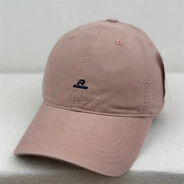 Dusty pink baseball cap, small embroidered logoA softer, powder pink rather than the saturated hot pink the name sometimes implies.Open this listing
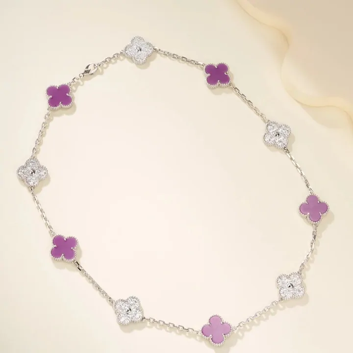 Purple quatrefoil pendant necklace, silver chainStone colour reads truer in this close-up than in most seller thumbnails.Open this listing
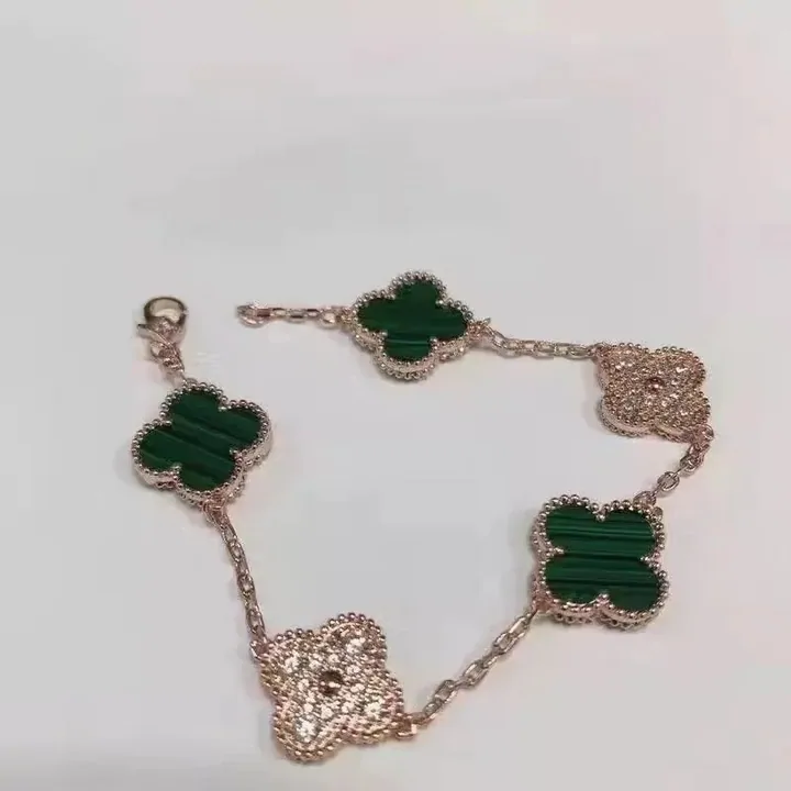 Malachite-green quatrefoil bracelet, rose-gold toneGreen stone against warm metal; photograph the two together, not separately, to judge the pairing.Open this listing
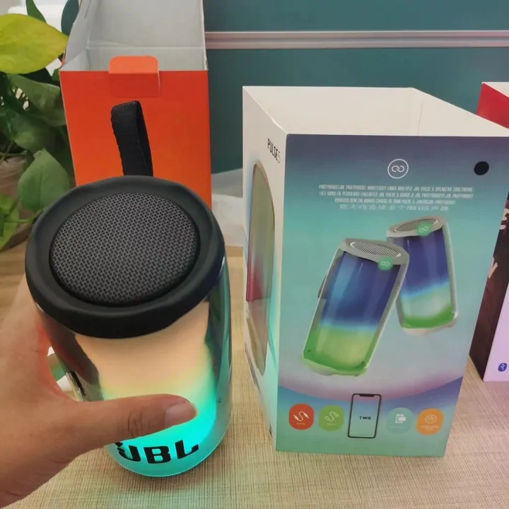 Rainbow-gradient portable speaker, litCase colour and the light effect are two different settings; check both in the listing photos.Open this listing
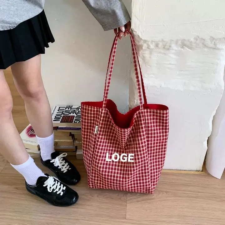 Red-and-white gingham tote bagA pattern rather than a flat colour; ask for a full-bag photo if scale of the check matters to you.Open this listing
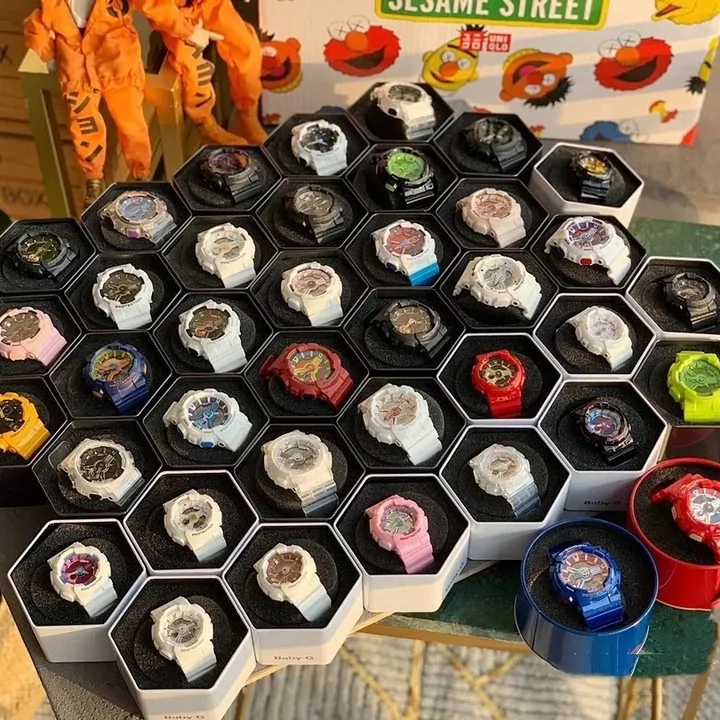 Tray of sport watches in pink, blue, red, yellow and whiteA good reference tray for comparing saturated colours against each other in one frame.Open this listing
Colour names worth checking twice on this rail
| Printed on the rack | Sold in English as | What tends to go wrong |
|---|---|---|
| 紫色 / 藕紫 | Purple / Mauve-purple | Two different shades sold under overlapping names; ask which if the listing photo looks ambiguous. |
| 玫红 / 桃红 | Fuchsia / Hot pink | Used almost interchangeably by different sellers for shades that are not identical. |
| 撞色 | Colour-block | Means two or more contrasting colours on one piece, not a single named shade; check which panel is which colour. |
Saturated colour is the one family where the camera is usually honest; the naming is where two sellers disagree.